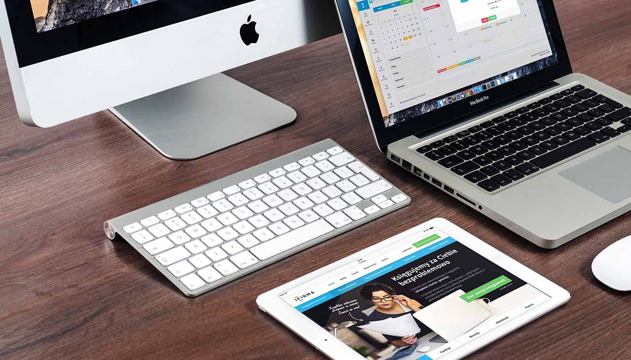
In this ever-changing digital world, developing a website that looks great on any device and provides users with an excellent browsing experience is one of the essential steps to ensuring success. Responsive design offers a solution for businesses looking to efficiently create websites that retain their visual appeal across all platforms. With tools like HTML, CSS, and JavaScript easily accessible to web developers, designing for multiple devices has never been simpler or more effective. In this blog post, we’ll dive deeper into the responsive design; from its history and benefits, to how you can incorporate it into your projects. Read on to learn why it’s so important – and potentially game-changing – when it comes to website development!
Understanding Responsive Design and the Benefits it Offers
Responsive design is an approach to web page creation that aims to provide users with an optimal viewing experience on any device. Through the use of fluid grids and flexible images, media queries, breakpoints, and other features such as optimized content, responsive design allows developers to create a website that looks great no matter what kind of device it’s being viewed on.
The benefits of using this technique are numerous: not only does it improve user experience by providing visitors with a seamless transition between devices; but it also increases access to your website – make sure you can be found in the search results regardless of the user’s device. Additionally, the responsive design reduces development costs; since one version of a website needs to be maintained instead of more than one, it’s much easier to manage. Finally, with a single version of the website, any changes are implemented more quickly and easily.
Creating a Mobile-First Approach to Design
When approaching a new website project, it’s important to consider the mobile experience first. This means designing for small screens before designing for larger ones; not only does this ensure that the design looks great on mobile devices, but it also allows developers to focus on creating an efficient user interface with improved usability and navigation. Additionally, following a mobile-first approach can help keep content refinement in check; by removing unnecessary elements from the beginning, developers will have already optimized their website for smaller displays before moving on to larger screens.
Using Flexible Grids and Layouts to Achieve Responsiveness
Flexible grids are one of the most important components of responsive design. By using relative units such as percentages and ems instead of absolute units like pixels, developers can create fluid layouts that will adapt to different screen sizes without any extra code or modifications. Additionally, developing flexible images within these grid systems is essential; if images aren’t able to resize along with the rest of the page, then responsiveness won’t be achieved.
Utilizing Media Queries and Breakpoints to Ensure Consistency Across Devices
Media queries are an invaluable tool for creating websites that look great on any device. They allow developers to check the device width and then alter the website’s layout accordingly; this ensures that the website looks its best regardless of which device it’s being viewed on. Additionally, breakpoints are used within media queries to determine at what point a website should switch from one layout to another; using these correctly is key for ensuring that content reflows properly across different devices.
Optimizing Content for Different Viewports and Platforms
Content optimization is another important piece of the responsive design puzzle. By focusing on how content is displayed on various devices, designers can ensure that users have access to all relevant information no matter which device they’re using. This includes optimizing headings, images, videos, and other content elements to make sure they look great on any device.
Testing Responsive Designs with Different Device Simulators and Browsers
Once a website has been developed using responsive techniques, it’s essential to test it across different devices, platforms, and browsers. This can be done using different device simulators such as the Chrome DevTools or Opera Mobile Emulator; these tools allow developers to quickly switch between various devices and check how their website looks in each one. Additionally, testing websites on actual devices is also important; this is the best way to ensure that everything looks great before a site goes live.


